
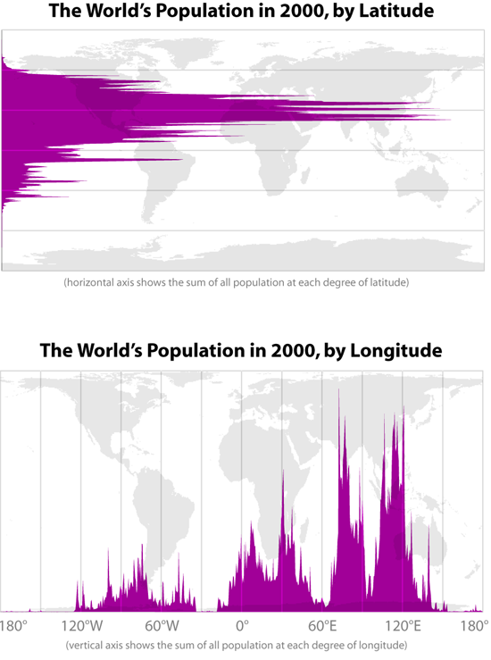
There are so many different ways to create a graph. You want to communicate your key point as clearly as possible. These 2 graphs created by Bill Rankin from Yale University in 2008 show how our world population looked in 2000 when sorted by latitude into north and south hemispheres. The graph shows that about 88% of us live in the northern hemisphere. On average the world’s population lives 24 degrees from the equator. When sorted by longitude it shows that most people live up to 180 degrees east of Greenwich. What are some different ways you create graphs in your classroom?